
Life's a garden. Dig it.
Challenge
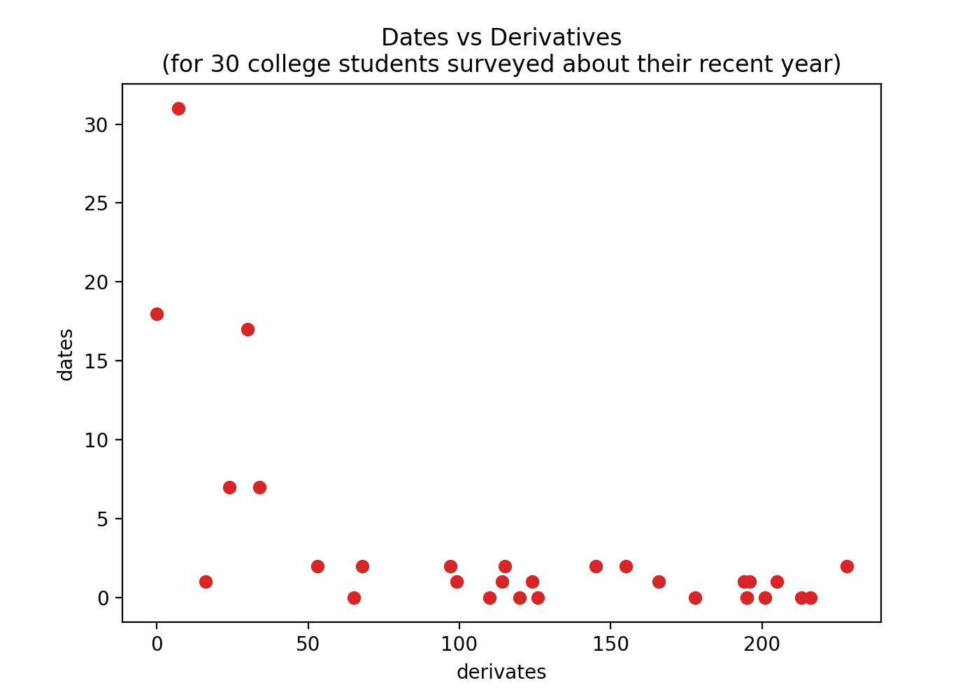
Thirty college students were surveyed on
- the number of derivatives they've calculated in the past year and
- the number of dates they've been on in the past year
import random

random.seed(1)
derivatives = [random.randrange(0, 250) for i in range(30)]
dates = [random.randrange(0, max(50 - d, 3)) for d in derivatives]

print(derivatives)
# [34, 145, 216, ..., 178, 114, 68]

print(dates)
# [7, 2, 0, ..., 0, 1, 2]
Build a scatter plot of this data with
-
derivatives on the x axis and dates on y axis (with labeled axes)
-
points using the color 'tab '
-
the title:
Dates vs Derivatives
(for 30 college students surveyed about their recent year)
Show the plot
Solution
import matplotlib.pyplot as plt

# Instantiate a figure and an Axes
fig, ax = plt.subplots()

# Draw a scatter plot on the axes
ax.plot(derivatives, dates, c="tab:red", linestyle='None', marker='o')

# Draw the title and labels
ax.set_title("Dates vs Derivatives\n(for 30 college students surveyed about their recent year)")
ax.set_xlabel("derivates")
ax.set_ylabel("dates")
Explanation
-
Make a figure with an Axes.
fig, ax = plt.subplots()pyplot.subplots()is a handy function for creating a figure and a set of subplots in a single line. The default behavior creates a single figure with a single Axes, but if we wanted, we could make a grid of Axes with something like this.fig, ax = plt.subplots(nrows=3, ncols=3)
Alternatively, we could create the figure and axes in a less cryptic (but lengthier) way, like this.
fig = plt.figure()  # make the figure
fig.add_subplot()   # add the subplot
ax = fig.axes[0]    # get the Axes object (for downstream changes)
Note that
axis technically anAxesSubplot.type(ax) # <class 'matplotlib.axes._subplots.AxesSubplot'>AxesSubplotis a subclass of the more genericAxesclass. -
Draw a scatter plot on the Axes.
ax.plot(derivatives, dates, c="tab:red", linestyle='None', marker='o')Here we use the
Axes.plot()method, passing inderivatives,dates,c="tab:red"(color),linestyle='None', andmarker='o'. By default,Axes.plot()connects points with lines (i.e. it draws a line plot). By settinglinestyle='None'andmarker='o', we get a scatter plot.What about
Axes.scatter()It's true,
ax.scatter(x=derivatives, y=dates, c="tab:red")works, but it's less performant thanax.plot(x=derivatives, y=dates, c="tab:red", linestyle='None').Use
Axes.scatter()when you want to customize the points (e.g. varying their sizes or colors by another variable)."tab " stands for Tableau red. See the Tableau color palette here.
You can find a list of additional matplotlib color palettes here.
-
Draw the title and labels.
title = "Dates vs Derivatives\n(for 30 college students surveyed about their recent year)" ax.set_title(title) # (1)! ax.set_xlabel("derivates") # (2)! ax.set_ylabel("dates") # (3)!- See
Axes.set_title() - See
Axes.set_xlabel() - See
Axes.set_ylabel()
- See
Solution 2 (PyPlot)
# Make a scatter plot
plt.scatter(x=derivatives, y=dates, c="tab:red")

# Draw the title and labels
plt.title("Dates vs Derivatives\n(for 30 college students surveyed about their recent year)")
plt.xlabel("derivates")
plt.ylabel("dates")
Explanation
This solution uses the matplotlib.pyplot state-based interface to matplotlib, with methods:
pyplot.scatter()(to draw the scatter plot)pyplot.title()(to set the title)pyplot.xlabel()(to set the x label)pyplot.ylabel()(to set the y label)
Is this better than Solution 1?
No.
Solution 1 is preferred because it provides more control over the figure and axes objects. ..but this solution is perfectly fine for ad hoc analyses.